A curatorial approach to dataviz
It is not what we think or feel that makes us who we are. It is what we do. Or fail to do...
Jane Austen

Introduction
When I was little – perhaps 6 or 7 years old – my parents actively looked for ways to get me closer to science and culture, this led them to take me on a series of museum visits. However, both being professionals focused on engineering and sciences, they found anthropology, natural sciences and technology museums particularly important and compelling. Yet, occasionally they would also take me to art museums, mainly those exhibiting traditional/classical art. My experience in those particular exhibition spaces used to be a bit frightening. As a child, being surrounded by paintings depicting passages from the Bible, pieces giving a deep insight of colonization in Mexico and a large set of portraits of people who looked really serious was quite scary. I remember feeling a mixture of fear and confusion that led me to think that the artists behind this works must have been very sad human beings since, to my very young eyes, all that obscurity could only mean something I couldn’t understand.
On the other hand, I clearly remember my first visits to modern art museums, the scenario was as follows: my parents – a bit sceptical by the artwork that surrounded them – tried their best to put it into context and explain to me what those images meant, yet, regardless of their logical inputs about these particular artworks, the only thing I could focus on was the colours: I was fascinated. Those vivid, bright shapes, rich in texture and playfulness captivated my senses and, for the first time inside an art museum, I felt like I could understand what was going on. Obviously (as seen through the eyes of a child with no formal art education whatsoever), those artists were people who loved colours, just like me, and were people who grabbed their tools and carelessly emptied their mind on the canvas, creating shapes that I could understand and, more importantly, that I could relate to. Those experiences left me completely mesmerized, always looking forward to going to museums that showed similar artworks. Of course, in the mind of a child, the approach I had to those practices relied on how many different colours I could count and imagining what those abstract silhouettes could be, just like laying on the grass and finding faces on the clouds, going to a modern art museum was a way of building stories of what could be, speculating about the life of the artists and even feeling a close connection with those who used my favourite colours. I dearly preserve these memories as the ones that made me fall in love with art.
As I started developing my professional career, I deeply engaged with practices that fused together art and technology, recently focusing on the use of alternative realities as a critical tool of the current socio-political state, but I never quite gave up my love for 20th century paintings, especially those pieces that stayed with me since a very young age. For a long time, I tried to create a link between these two worlds – which represent a couple of my biggest curatorial passions – but I had a really hard time finding a way to do so, especially considering that as a young independent curator it’s almost impossible to get my hands on many of these pieces due to economic limitations, as well as having little to no contacts inside art institutions. This lead me to explore possible solutions to these issues inside the use of digital technologies, the internet, open source software and the practice of people who shared similar interests.
During this process, I attended to various conferences regarding digital humanities and – during a workshop leaded by visual semiotics researcher and professor Dr. Everardo Reyes – I realized that the answer could be hidden within the manipulation and representation of data. Dr. Everardo Reyes has dedicated a big part of his research and practice, both as a professor and as an artist, to data visualisation, hypermedia, visual semiotics, new media and software studies and has contributed to the digital art movement through the organization of international conferences. Interestingly, in 2008, he organized the 2nd Computer Art Congress – held in the Tecnológico de Monterrey Campus Toluca and Estado de México – where he included the exhibition of 35 artworks inside the Modern Art Museum of Toluca, an unprecedented event for my hometown.
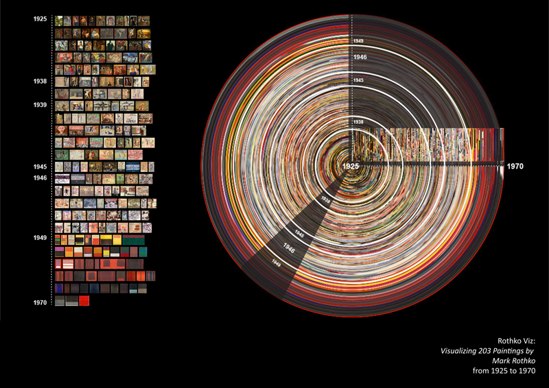
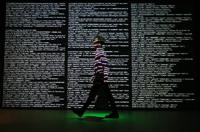
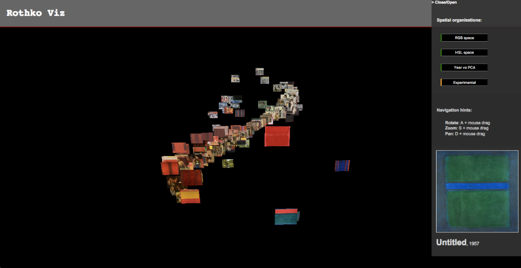
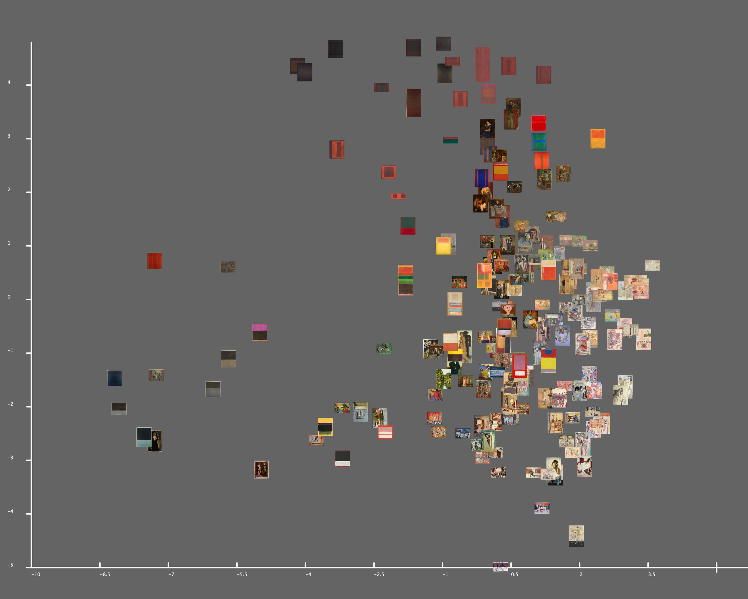
It was clear from the start that we shared a vision that fused modern art and digital practices together. Furthermore, I had the opportunity to navigate through some of his current work involving these two areas and found a stunning data visualisation project that happened to be the answer to my questions: Rothko Viz, visualising 201 images of paintings by Mark Rothko.
This visual exploration is composed by static images, interactive maps and 3D graphs and is capable of providing a sensible insight to Mark Rothko’s artwork, due to the fact that it’s not using these 201 images of paintings just as mere data, but as the fuel for a deeper connection with the artist. This last statement becomes obvious when we realize that the viewer can interact with the dataviz (short for data visualisation) by rearranging the patterns of research and is also capable of looking for particular characteristics within these paintings, which grants him/her the opportunity to connect with the artwork in a much more personal way, even if he/she isn’t fully familiar with the artist.
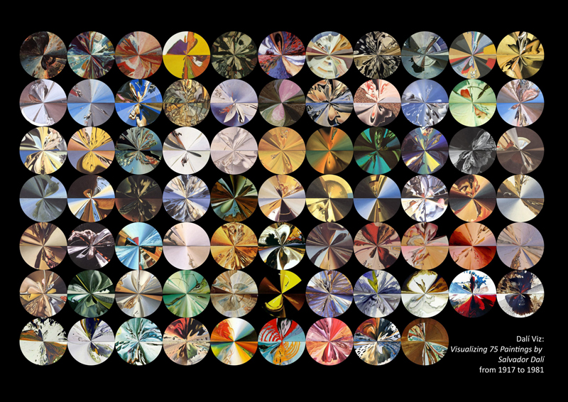
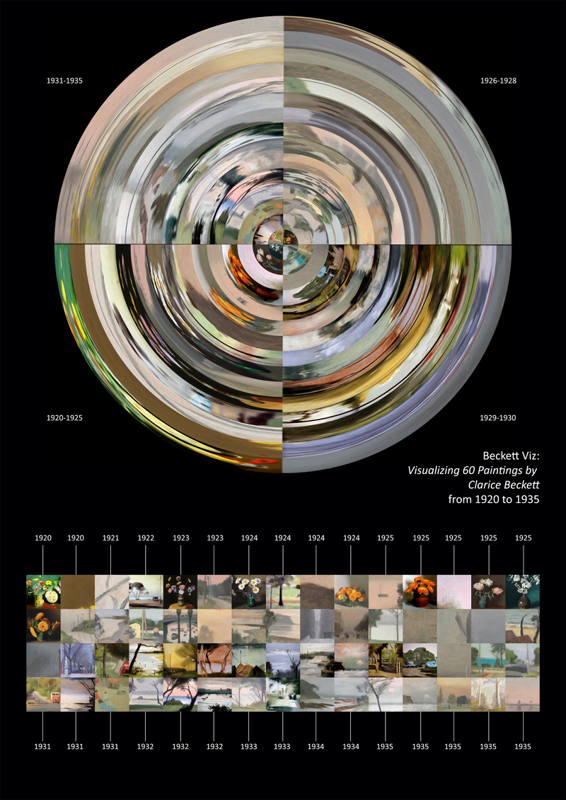
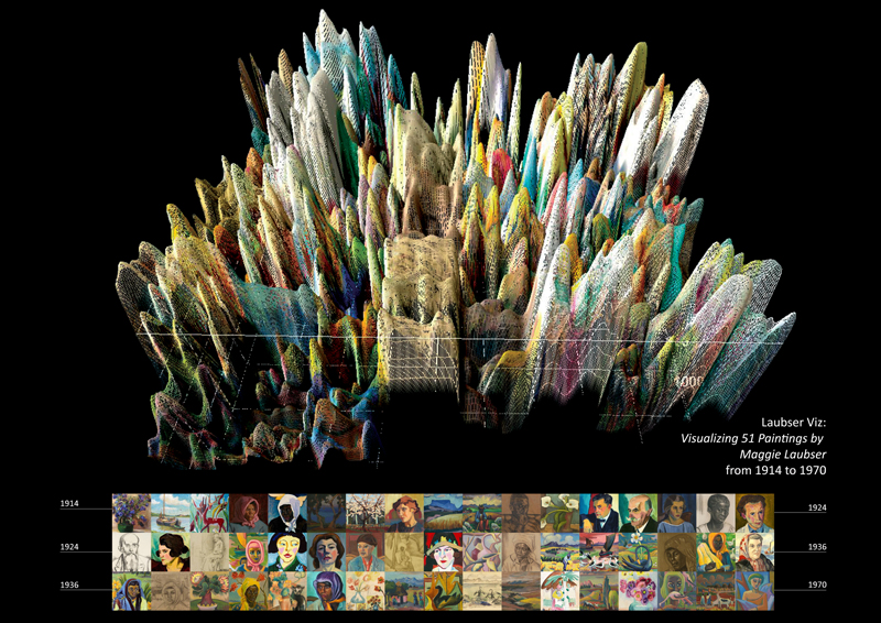
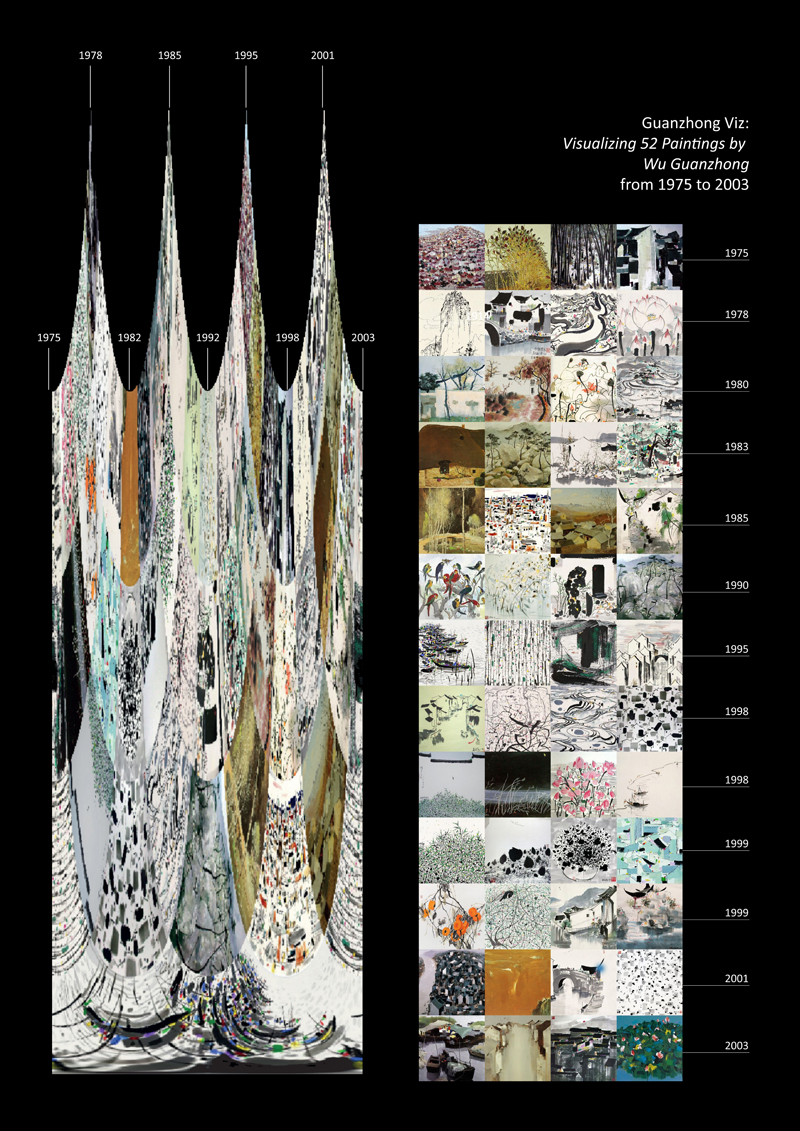
Rothko Viz opened a new possibility that I haven’t considered before: the use of dataviz as an alternative for exhibiting a large number of artworks (without necessarily needing the pieces to be physically present) while, potentially, providing an intimate approach to the evolution, process of creation and development of an artist’s career. As a consequence of this, and after considering various possibilities that went from the use of open books to open on-site explorations through search engines, I came to the conclusion that dataviz is the perfect tool for developing the exhibition Digital insights of 20th century painting – curated by Xiaoyu Lyu, Xuan Yan, Shuosheng Gan, Junqing Zhu and myself – which focuses on a sensible visual analysis of the artwork of Maggie Laubser (b.1886 in Bloublommetjieskloof Malmesbury district Cape Providence, South Africa), Clarice Beckett (b. 1887 in Casterton, Australia,), Tarsila do Amaral (b. 1886 in Sao Paulo, Brazil), Salvador Dalí (b. 1904 Catalonia, Spain), Wu Guanzhong (b. 1919 Jiangsu, China) and, last but not least, Mark Rothko (b. 1903 in Vitebsk Governorate, Russia).
In this essay, I will address several points that have shaped the final curatorial proposal for the exhibition Digital insights of 20th century painting, focusing on: the definition and evolution of dataviz from its origins as – mainly – a research tool to its role inside art; its potential inside curation as an alternative for low budget exhibitions; and a tool for education-oriented exhibitions.
What is dataviz?
Data visualisation can be defined as the outcome of processing, encoding and transforming quantitative, qualitative, relational, and/or spatial information into visual material, usually, for making its analysis easier. This tool is mainly used within a context of large, complex data sets such as big data – extremely large information sets that may be analysed computationally to reveal special behaviours and associations, especially relating to human behaviour and interactions (Oxford dictionaries 2015) – where patterns, trends and correlations that might go undetected in text-based data can be exposed and recognized easier (Rouse, 2012). Furthermore, it is important to point out that this concept is normally used for those practices that involve the use of digital technology and – more specifically – computer generated dataviz.
Under this simple definition two things are clear: first, that data visualisation involves several practices and methods that have been used for various areas and, second, that the intention of being able to communicate data and/or information through images – with the specific objective of making it easier to understand – has been around for a long time. Classic examples of early data visualisation include: Charles Menard's figurative map of Napoleon's defeat and retreat during the Russian campaign of 1812, John Snow's dot map of cholera cases during the London epidemic of 1854 (Dougherty, 2017) and the 3D model of the Swedish census of the population from 1750-1875 by age groups drawn by Luigi Perozzo.
However, we can trace its origins even further back in time and tie them to the first approaches to cartography and the creation of military strategies through maps, lines and colours. In fact, we can find examples since the very beginning of human civilization where the need of developing a language capable of facilitating daily-life – such as hunting – was urgent. Yet, this first approaches were not directly meant to be a simplified way of communicating complex information, actually it wasn't until the settlement of civilizations where the aim for sharing complex data was clear. During pre-history, the ancient Babylonians, Egyptians, Greeks and Chinese all developed sophisticated ways of representing information visually to plot the movements of the stars, produce maps to aid navigation, and develop plans for crop planting and city development (Centre for Research in Education, Art and Media, 2009).
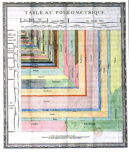
Important examples that came after this period of time were the Roman maps, Ptolemy’s world map, Su Song’s Celestial Atlas, the diagrams of relationships between knowledge created by Ramon Llull, the First Modern Atlas created by Abraham Ortelius, Christoph Scheiner’s images of sunspots and the Tableau Poleómetrique created by Charles de Fourcroy just to name a few.
It is important to point out that the boom of data visualisation as a concept arrived with the digital tools and supercomputers. Actually – merely as a curious fact – one of the first computers was the result of the cryptanalysis developed by Alan Turing during the Second World War, where the very first intentions were to be able to create a machine capable of decoding a massive amount of data in order to understand the secret messages that it carried. Hence, we could say – in quite a simplistic, yet direct way – that the development of the computer as we know it, is the consequence of the search of the deep understanding of complex data. As it happens with most technological tools, the first uses of these devices were inside the military forces and the industry; there, the evolution of charts, graphs and the general translation of numerical values into images evolved, and little by little the search for easiest, most accurate means of representation became important.
In order to understand the evolution and practical uses of these methods of visual representation and communication we need to understand the general reasons that have proven that, in fact, these visual interpretations are necessary. To do this, we could take the core concepts of the Gestalt theory developed by German psychologists in the 1920’s. These concepts attempt to describe how people tend to organize visual elements into groups – or unified wholes – when certain principles are used. These principles are: proximity, a contiguity between images tends to indicate they belong together; similarity, when the images depicted are alike people often perceive them as a group or pattern instead of individual objects; common fate, by the visual grouping of images we can deduce which ones will behave in a similar way; continuity, seeing things as sequential elements rather than individual lines; closure, the tendency of closing simple figures; area, it states that the smaller of two overlapping figures will be perceived as a figure while the larger figure will be seen as “ground”; symmetry, which refers to understanding the centre as a focal point of the image. These concepts allow us to understand that, when mixed with the use of digital technology, we are actually able to create measured visual representations that help create clearer messages.
While talking about data visualisation it is important to point out that there are various techniques that surround this tool, therefore the results can vary. The outputs can be as simple or as complex as the input requires.
Inside the world of dataviz we can find:
1D/Linear: lists of data items, organized by a single feature (e.g., alphabetical order); 2D/Planar: choropleth, cartogram, dot distribution map, proportional symbol map, contour/isopleth/isorhythmic map, dissymmetric map, self-organizing map; 3D/Volumetric: 3D computer models, surface and volume rendering, computer simulations; Temporal: timeline, time series, connected scatter plot, Gantt chart, stream graph/ThemeRiver, arc diagram, polar area/rose/circumplex chart, Sankey diagram, alluvial diagram; ND/Multidimensional: pie chart, histogram, Wardle, tag cloud, unordered bubble chart/bubble cloud, bar chart, radial bar chart, tree map, scatter plot, bubble chart, line chart, step chart, area chart/stacked graph, heat map, parallel coordinates/parallel sets, radar/spider chart, box and whisker plot/candlestick chart, mosaic display/Marieke chart, waterfall chart, tabular comparison of charts, small multiples; Tree/Hierarchical: general tree visualization, dendrogram, radial tree, hyperbolic tree, tree map, wedge stack graph (radial hierarchy)/sunburst, icicle/partition chart; Network: matrix, node-link diagram (link-based layout algorithm), dependency graph/circular hierarchy, hive plot, alluvial diagram, subway/tube map.
Furthermore, fusing together the potential of algorithms with visual representations has opened the door to the creation of creative – and potentially compelling – images. Throughout time the results of using this power tool have become much more playful and visually appealing, becoming exciting ways of presenting complex themes to new audiences. Little by little it became the perfect transition between visual communication design and science, due to its nature of facilitating the consumption and understanding of information that resulted in better informed decision-making. An interesting characteristic of this tool is that it allows non-specialists to manipulate information; people who could have felt excluded from data, have now access to it. This, alone, represents a huge improvement for information transparency (Bazin 2012).
The reason why I’m making such a profound emphasis on the large amount of possible shapes/forms that dataviz can take, as well as how it has been developed through time (and stepping a bit aside of the issues with the transparency, the accuracy of data and the distribution of such knowledge), is to pose the following questions: what can be contained inside these representations?, who is developing these complex images?, is it possible that artists, designers and creative professionals are also involved in producing such visual material? If so, what are they using this tool for?

Dataviz as art
As we saw in the last section, the production and use of data visualisation grew exponentially by the implementation of digital tools for its creation. In fact, this growing world of digital tools led to changes in pretty much every area of production; including art production. In words of writer Holly Finn, we should be celebrating the really new and relevant: the rise of the data visualizers. Their medium is the one with momentum, the one genuinely changing how we think and feel. And it's about to boom (Finn 2016).
While talking about how culture has been shaped through time I’d like to quote the following statement:19th century culture was defined by the novel, 20th century culture by cinema, the culture of the 21st century will be defined by the interface (Manovich, 2015). In which the word interface can be understood as a device or program enabling a user to communicate with a computer as well as a point where two systems, subjects, organizations, etc. meet and interact (Oxford dictionaries 2016). This resonates with various concepts surrounding contemporary life such as: flow of information, privacy, identity, big data, digital echo chambers and data creation / consumption.
Furthermore, one of the biggest changes related to the use of data visualisation as an art form was the dissemination of the internet. It wasn’t until we, as users, were confronted with a large set of information just one click away that we could easily access, hack and intervene the data that was being produced inside the WorldWideWeb. Since the late 90’s we can see a growing number of artists using data – mainly accessed and extracted from the web – as the raw material for their artwork. However, it wasn’t until the early 00’s that their artwork started being recognized as a proper art form and being shown in curated exhibition spaces.
It is clear that those behind the use of this medium tend to be artists who are right on the edge of art and technology, and who have the direct intention of showing certain data sets in a way it hasn’t been seen before. Here, their reductive nature abstracts information, but in doing so, disseminates scientific ideas, data, or actual facts, to a wider and more diverse audience. This interdisciplinary approach provides alternative constructs to the role of the artist, and creates a more comprehensible and tangible experience for the audience (Coughlan 2015).
An example of the use of data visualisation inside art is the piece A More Perfect Union (2011) by R. Luke DuBois, where he aims to refashion our political discourse by placing the most used words in dating sites inside a map of where these words are linked to. Surprisingly, this artwork shows how most people using these websites are no longer describing themselves by capitalist terms such as how much money they earn or which professional area they work in, but by using more sensible information linked to emotions such as what they like doing on a Friday night, their favourite movies and even who they want to fall in love with. A More Perfect Union (2011) points to the creation of a reverse study where the artist is quantifying data out of fields that are rarely reviewed by analysts due to its (mainly) non-commercial nature, and by doing so the artist is reclaiming the values of what’s important (romantically speaking), instead of just sterilizing emotions by transforming them into formal data. On this same line, the artist shares that it’s not just about plotting a bunch of numbers, he reflects that “you’re drawn to this piece because it is visually appealing, then you realize what it is, then you want to know where it came from, then you want to know how it works and then you start making questions about you: what does this tell me about myself?” (R Luke DuBois 2015).
On a similar way, artist Fernanda Viégas claims that her approach to data visualisation was a result of fascination and frustration because it meant having access to such a powerful medium that hasn’t been used in a cultural and emotional way. Data visualisation has a long history of being academic or being something that only experts use, it looks scientific therefore it’s look and feel tends to relate to something that could be called official or true (Viégas 2015). Moreover, these artists are interested in making data visualisation become an expressive medium, in order to be able to look at other kinds of information. Here we could say that data visualisation becomes data storytelling and that, due to its aesthetic nature, translates into amazing interfaces that create great stories.
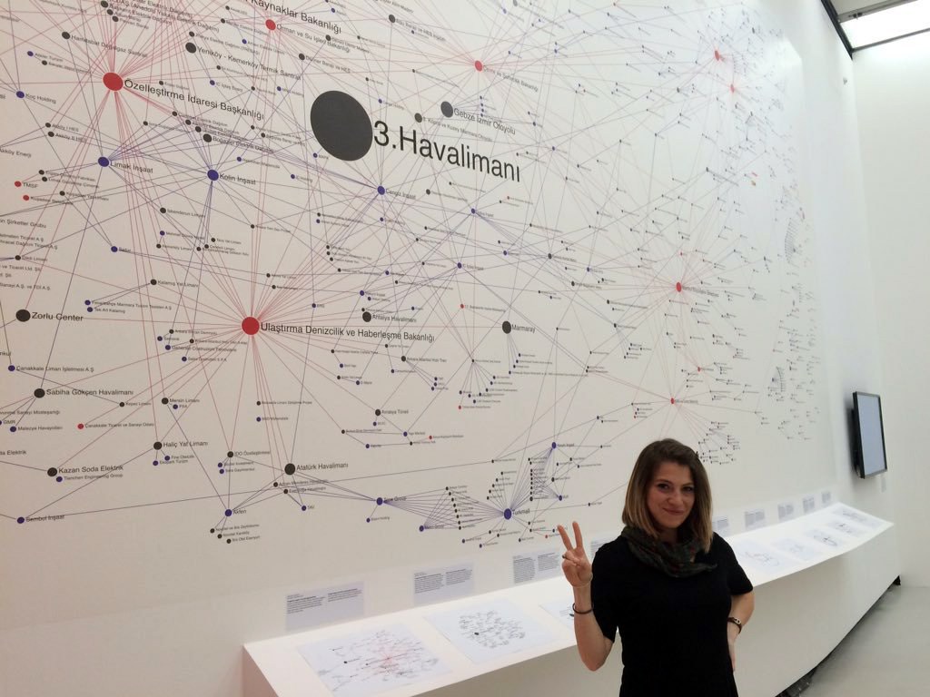
Furthermore, the goal of data-driven digital artists is clear, not cynical: convey complex concepts quickly and crisply. They want to generate not Art-with-a-capital-A, necessarily, but understanding. They take stone-cold data—units of information—and turn them into something warmly communicative. Beautiful, too. (Finn 2016). An example of the later is the politically driven piece Networks of Dispossession (2013) developed by Burak Arikan in collaboration with Zeyno Üstün, Yaşar Adanalı, Özlem Zıngıl, Özgül Şen and anonymous participants, in which they mapped out the relations of power and capital in Turkey by linking 606 companies and financial organizations, 51 government institutions, 38 media firms, and 500 projects. This project, which has been quite controversial specially in Turkey, empowers the audience to make sense of the links depicted and understand the way this relations between organizations, companies, media and the government could potentially impact in the local socio-political situation; the fact that this piece doesn´t create conclusions or shows an analysis with legible consequences of the information shown is leaves the audience making their our questions and building their own stories, and by doing so it encourages the use of critical thinking.
What we could conclude about the intentions behind the use of this medium for artistic purposes is that even if there are two main areas: one that focuses on evidencing links between power figures, questioning the use of our personal data as a commodity for big corporations and the government, as well as critiquing to the loss of privacy and the implications of being seen as a number; and a second one reclaiming the poetics of data by appropriating a tool that normally deletes the emotional side of the inputs by transforming them into numbers, andfinally, reverting the traditional process by adding a human side to the outputs by creating approachable experiences. There are many points in common that have to do with creating collaborative crowd-sourced inputs, the direct interaction of the audience with data that isn’t easily accessed and a powerful means for transparency. In other words, it is not about the scientific rendering of an image, but the interpretation of it.
Dataviz as a curatorial tool
Up until now we’ve seen how data visualisation has evolved through time and how art has appropriated this medium for creating a deeper dialogue surrounding the flow of information. However, there’s another side of the use of dataviz within the cultural circuit through curatorial studies. It is clear that this tool has had a big impact in the way contemporary research is performed – especially when it comes to analysing large sets of data – yet the potential of the medium goes further than that.
To understand the way in which we could approach dataviz as a curatorial tool, we need to understand the inputs that can be used and the possible outputs. While talking about data inputs we can distinguish two main areas: structured data – referring to highly organized information such as data tables normally fitted into columns and rows, following a strict order (categorical, numerical, etc.) – and unstructured data – any kind of information that could be plotted together with no categorical/numerical approaches such as images and text–. From these possible inputs, we can clearly see that the first one responds to a strict research approach, where the main importance of the output is to be able to communicate complex data to the audience; while the second one has a lot more to do with the poetics of information and the humanization of technologies. Curators haven’t been disconnected from the use of these discourses inside their work and for more than a decade this medium has made its apparition in several exhibitions worldwide. While talking about how it has been used as curatorial tool, we can distinguish three main areas:
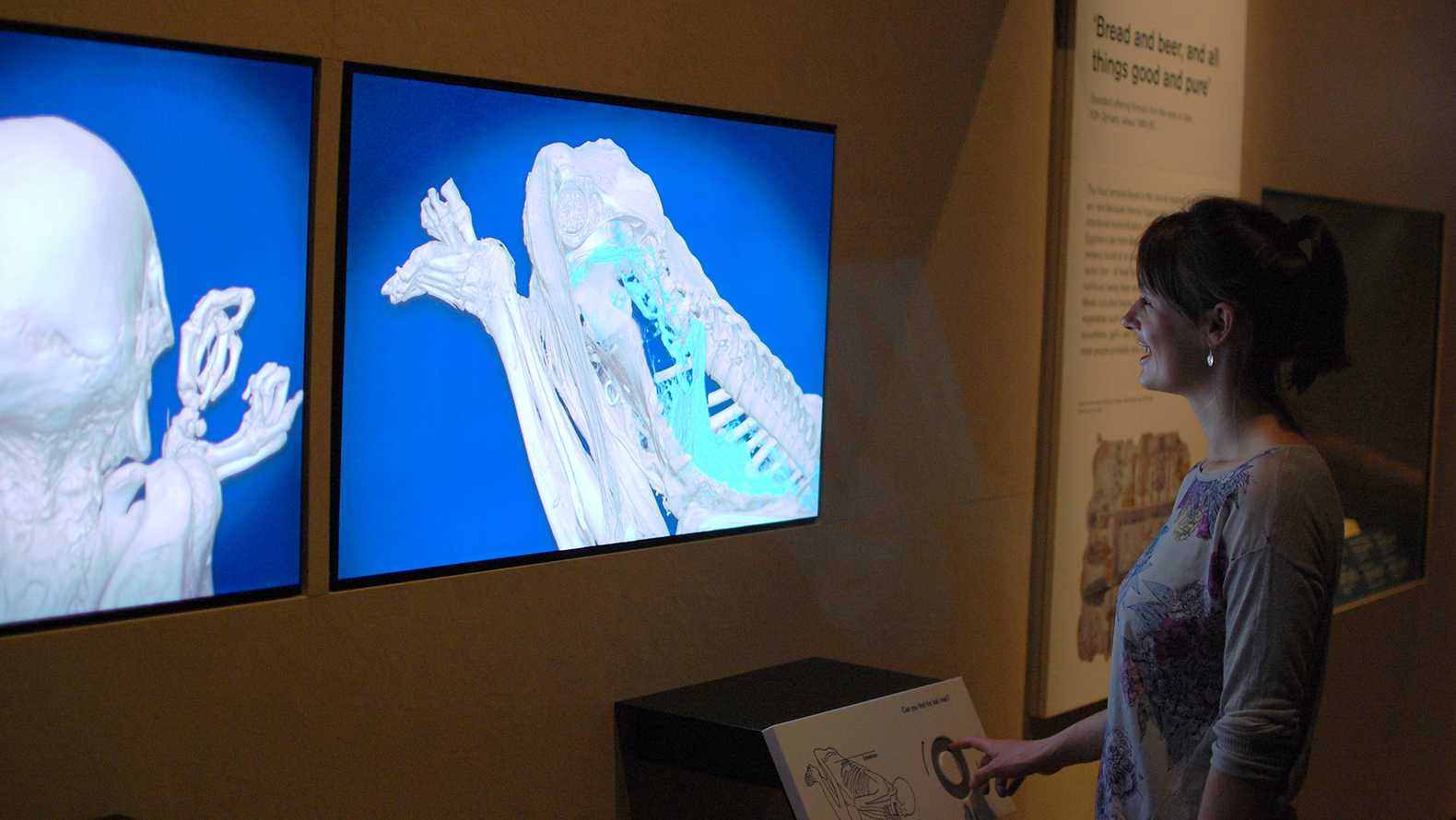
1. As a vehicle for understanding complex data:
This normally involves the commission of data visualisation for explaining a certain theme. We could say that this is the traditional process of how dataviz is created, since there is an existing data set that needs to be translated into images, colours, shapes and textures. Normally, these representations belong to exhibition spaces related to science. However, more recently art museums have started to use them for stablishing links between artists, places, techniques and so forth. The intentions behind the idea of using dataviz as a vehicle tends to point to a deeper understanding of a large amount of information. One example of this is the exhibition Ancient lives, new discoveries, curated by Daniel Antoine, held in The British Museum in 2014. This exhibition introduces the audience to eight people from ancient Egypt and Sudan whose bodies have been preserved, either naturally or by deliberate embalming. These mummies are shown both, physically and digitally, by showing the actual remains next to interactive data visualisations that aim to grant access into the lives of these people. From a priest’s daughter to a temple singer, a middle-aged man to a young child, a temple doorkeeper to a woman with a Christian tattoo, this exhibition showed how they lived and what happened to them after they died. Using interactive technology, this exhibition gave access to discovering new information about each mummy, from their state of health to how they were embalmed and preserved. The exhibition unlocked hidden secrets to build up a picture of their lives in the Nile Valley over a remarkable 4,000 years – from prehistoric Egypt to Christian Sudan. (The British Museum 2014). This exhibition was developed with the intention to unravel the secrets of these mummified bodies through the use of technology, a practice that is common for those behind the scenes working directly with these bodies, but that seems to be hard to access by those who are not experts in the area. It is a clear example of how to enhance a piece that contains more information than the eye can see, by letting the audience interact with data that they wouldn’t be able to access in any other way.
2. As part of an exhibition that focuses on the medium itself:
By this I mean the use of dataviz for exploring its own history, evolution, impact and the role it plays inside various areas. This resonates particularly with the use that science museums have given to this tool. Let´s take for example the exhibition Beautiful Science: Picturing Data, Inspiring Insight, curated by Dr. Johanna Kieniewicz, held at The British Library in 2014. This exhibition behaved as a retrospective of data visualisation in the scientific field – focusing on public health, weather and evolution – and the impact it has on contemporary research. It gathered together many diagrams, charts, drawings, and digital-based images and models, from an early visual representation of a hierarchically ordered universe in Robert Fludd’s ‘Great Chain of Being’ (1617) and Florence Nightingale’s seminal ‘rose diagram’ (1858), which showed that significantly more Crimean War deaths were caused by poor hospital conditions than battlefield wounds, to a contemporary moving infographic of ocean currents from NASA, this exhibition showed how visualising data has changed the way we see, interpret and understand the world around us(King 2014). It created a proper space for going through past, present and even future science-related research and showing the beauty of organising, mainly, structured data. Simultaneously, it showed the importance of visualisation for making new discoveries and for communicating those discoveries effectively (Howe 2014), as well as getting non-expert audiences to interact and understand the contents of what was being showed.
3. As a medium or as part of the creative production:
This might be a fairly recent approach to dataviz, since it officially accepts it as an art form. It mainly focuses on being able to display this type of artworks in the best way possible in order for them to communicate directly with the audience. Here, the curator plays the role of a translator between the artwork and the audience and by using this medium he/she is creating the proper environment for these pieces. An example of this is the exhibition Big Bang Data, curated by Olga Subirós and José Luis de Vicente, held at Somerset House in 2015. This exhibition aimed to raise awareness about big data and its relation to politics, economy and society; it showed how we – as users of the internet and technological gadgets as smartphones, fitbits, laptops, etc. – are completely immersed in the creation of sub-structures of power by showing a series of infographics and installations that were created specifically for making evident these hidden intentions of the digital platforms that surround us. With pieces like the polemic Face to Facebook project that shows our lack of control over the data we upload to social media. This project, developed by Paolo Cirio and Alessandro Ludovico, was created by stealing the information of several Facebook accounts and using it to create fake profiles in the dating site lovely-faces.com – some of these profiles were discovered by the actual people whose information was used and resulted in a world-wide covered story. To data experiments like I Know Where Your Cat Lives by Owen Mundy that offers a fun take on a similar theme, plotting the location of a million cats on the world based on public social media posts, or a project developed by the Guardian, which demonstrates how its journalists used data from 19.6 million house sales in the UK over the past 20 years to create an easy-to-use interactive highlighting the affordability of areas based on users’ salary (Steven 2015). All these examples come together in order to communicate a bigger message. The richness of this exhibition relied on the diversity of its content as well as the different perspectives that wove together a deeper story.
By analysing the way in which dataviz is used inside curation, we can still see a strong attachment to the sciences due to the fact that this medium has been primarily used in these areas, however there’s a big opportunity to uncover its full potential by using it inside art-focused exhibitions. In this sense, I propose to add a new category to this list:
4. As an entry point for sensible analysis
While talking about the potential of dataviz I’d like to make a particular emphasis in how approachable it has become in recent years for non-experts to build their own infographics and interactive charts. We are currently living in what we could call the tutorial and open source era in which it is easier than ever to learn to use pretty much any software through free online tutorials, and the software for creating data visualisations is no exception. There’s a large number of online platforms dedicated to offer free, approachable access for developing infographics, charts, interactive graphs, etc., such as Graph Commons, Text Analyzer, Word Cloud Generator, Word Tree, Voyant Tools, Google Fusion Tables, RAWGraphs and Gephi, just to name a few.
In recent years, we’ve seen a constant struggle for keeping art education as a core area in public schools, sadly this is not exclusive of certain places since we can see it happen in various countries across the globe. Therefore, there are plenty of opportunities for curators to engage with this conversation and provide an alternative for approaching art education through developing an entry point through education-oriented art exhibitions. Keeping this in mind, this medium could provide an accessible solution, especially for spaces working with a limited budget. An example of how this tool could be implemented in exhibition spaces of this nature could be as follows: by creating a dedicated curatorial team who will be in charge of delivering exhibitions; teaching this team how to use the free online software for creating dataviz; purchasing/renting the basic equipment for displaying this pieces, this could include projectors, screens, tablets and computers, same equipment which could already be in possession of the exhibition space and/or alternatively printing the non-interactive dataviz. This simple structure could also be easily replicated.
By generating exhibitions where data visualization becomes an alternative for the “open book” – where the intention is not to substitute the artwork but to be able to create a starting point for those interested in art – these spaces could also be attracting new audiences by the use of interactive material. It’s important to say that this tool could be approached as an active agent for developing a sensible analysis, and in this way the audience would have access to visual material and be free to interpret its content in their own way. Unlike an “open book” exhibition, the use of this medium could grant a direct access for the audience to focus in what attracts them the most and, potentially, open the door for questions that could lead to further research of the pieces/artists represented.
We can see this is a similar approach to the use of dataviz to the one given in the first example of this list (as a vehicle for understanding complex data). However, the difference relies on the intentions behind the use of this medium. In the first case, the core objective is to grant access to data that is normally just read by experts, while in the last one the aim is to provide an entry point for a sensible analysis of artwork. In the latter, the images depicted are not treated as plain data but as an act of understanding the artists on a personal level. Since this last section hasn’t been fully developed in the art circuit, I’d like to use as an example the exhibition that resulted of this research: Digital insights of 20th century painting.
Digital insights of 20th century painting
In visual art, Realism often means artistic representation of reality as it is, an act of mimesis. Compared to Romanticism, which emphasizes subjective experience and emotion, Realism focuses on facts and ordinary life. In the 19th century, Realists depicted figures and scenes as they were experienced—or might be experienced—in everyday life. They often participated in social movements through their paintings. For example, Gustave Courbet (1819–1877) portrayed working-class life in his paintings. In the digital era, which we’ll define as “life with smartphones,” how has realism been adopted in a networked environment? Does new technology help to continue the artistic intentions, achievements, and aesthetics of Realism? If so, how? (Min 2015). In the opposite way, and reconnecting Romanticism, could we also use technology to fuel an emotional analysis? is it possible to trigger an intimate connection between the artwork and the audience through the use of digital tools?
The proposal for this exhibition fundamentally relies on the way we understand 20th century art in the digital age. The idea for our exhibition proposal was inspired by Rothko Viz: Visualizing 201 paintings by Mark Rothko, a series of data visualisation experiments created by Everardo Reyes, which consists in tracking the evolution of Rothko’s artwork through the use of digital technology. This series is an example of a visual analysis of painting through dataviz, which could be used for research purposes as well as an educative tool. It includes 2D images, 3D models, charts that show the transformation of Rothko’s artwork plotted within X and Y axis and interactive maps. However, due to its nature, this project hasn’t been formally presented in any exhibition space before.
Having this project in mind, and considering the potential it has to uncover the evolution and personal development of artists, we worked closely with Everardo to generate the visualisation of the artwork of six painters of the 20th century.
In order to be able to provide a worldwide view of 20th century painting, in addition to American abstract expressionist painter Mark Rothko, we explored the artwork of Spanish artist Salvador Dalí – a well-known multidisciplinary artist whose paintings gained particular attention due to his strong influence of Renaissance masters, and one of the strongest figures of Surrealism –; Australian painter Clarice Beckett – famous for her use of colour and dreamy landscapes as well as her painting techniques which allowed her to create a sense of transparency in her paintings–; Tarsila do Amaral, from Brazil – also known as "the Brazilian painter who best achieved Brazilian aspirations for nationalistic expression in a modern style" (Lucie-Smith 2004) and core member of the art group Grupo dos Cinco; South African artist Maggie Laubser – who is considered to have introduced Expressionism to South Africa, as well as working with diverse elements of Fauvism, and a pastoralism that belie the German Expressionist prototypes she was surrounded with (Harmsen 1985) –; and Chinese painter Wu Guanzhong – famous for his mix of Fauvism and Chinese calligraphy as well as a deep interest for creating bridges between East and West –.
We defined the central theme of this exhibition as Digital insights of 20th century painting. And through the display of these exhibits we would like the visitors to submerge into diverse paintings that belong to the 20th century in the era of digital media, and hopefully engage into a deeper conversation about inspiration, sensibility and an intimate approach to the artist’s career. Our objective is to highlight how digital technologies can be used to understand a non-traditional side of art history, while simultaneously encouraging the audience to read multiple artworks at the same time, as an allegory of contemporary visual consumption, and hopefully building new links with the process of creation. Also, we want to show a global view of 20th century painting by selecting big names from very different places, we managed to have one artist per continent as a way to provide access to, at least, one new artist to the audience. We aim to show a face of this artists that’s not commonly known unless you’re an expert and, through this, providing the opportunity to connect in a different level with the artists and look beyond their well-known pieces.
The core idea is to create the digital visualization of these artist’s evolution and explore diverse curatorial solutions for their display, for this exhibition we propose the creation of three areas:
· The interactive area: this space will be composed by six iMacs which will be displaying the interactive data visualisation of each artist. This section encourages the audience to explore the dataviz presented on a personal level, they will be able to follow the links that each of the pieces offer and go through the images in full detail.
· The 2D area: this area, placed right in the middle of the exhibition space, will have large-scale 2D printed material showing infographics of each artist. This area is meant to be the first approach to the dataviz and will be displayed in such a way that the audience can surround the printed material.
· The reading area: here the audience will have access to a selection of art books with information about each of the artists as well as theory books focused on art history and further research of 20th century painting.
This exhibition aims to reconnect with the concepts of sense and sensibility (resonating with the famous novel Sense and Sensibility written by Jane Austen) by providing the representation of the evolution of six different artists, making visible their favourite shapes, forms, colours, places and even providing an insight to their personal development. It uses sense, evoking the logical as the use of technology, and sensibility, reconnecting with the intimate connections with the audience built through emotions, as a way of creating a conversation between art and technology. Unlike reading a book about the artist’s life, this exhibition relies on their artwork to tell the artist’s story. It aims to connect on a deeper level that has to do with feelings and sensations rather than just an intellectual approach. Digital insights of 20th century painting is directed to a broad audience and it is meant to be understood from diverse areas of knowledge: from the formal research background that each of the dataviz required in order to be made, to the playful potential of the interactive infographics that will allow the audience to focus on specific pieces and/or artists and explore their artwork individually, to the light-hearted reading area that complements the experience not only by providing more structured information about the artists but that will also encourage the exchange of ideas between the members of the audience, the curators and the visual researcher and teacher Everardo Reyes.
Since this exhibition was envisioned as education-oriented, a complementary public program will be opened to develop a data visualisation workshop given by Everardo. This workshop introduces different approaches on how to visualize heterogeneous data-sets with software and programming libraries. First, a brief introduction to tools and methods will be given. Then, participants will be invited to work on their own data-sets. Examples of cultural data-sets include: visual imagery, networks of relationships, and text corpora. Participants will learn to: recognize the specificities of tools and methods according to data-sets; distinguish how tools operate on data-sets; identify how to organize a data-set according to a specific type of visualization; and have a glance at how to extend visualization tools and methods for more original results (Reyes 2017). All the software used will be free and open source with the intention of providing approachable and useful knowledge that the participants could use outside of the workshop and even share with others.
We’d like to build a legible bridge between past, present and future, and potentially open a door for the way we understand modern art and digital tools. We, the curators of this exhibition, hope that it will prompt the viewer to have a different view of the role of digital technologies for the understanding, development and archival of traditional practices as well as providing a sensible insight to the life and work of Mark Rothko, Tarsila do Amaral, Salvador Dali, Clarice Beckett, Wu Guanzhong and Maggie Laubser.

Conclusion
We are living in a moment in time where the technologies available are more approachable day by day, and where the potential of combining efforts in order to develop deeper, fuller outputs is growing exponentially. It is also clear that the role of curators within the arts has changed through time and that now, more than ever, being able to engage with new audiences while creating an important input for the art circuit is necessary. It is also important to point out that in order to secure bright new generations of artists we need to start talking about the role of art education and what role do curators play in relation to it. Curators can be an important element in the healthy evolution of art education, especially inside those communities that don’t have direct access to a large number of museums, galleries and/or exhibition spaces; here, the need of affordable, appealing and, most importantly, education-driven exhibitions is essential.
The use of data visualisation as a curatorial tool for developing low-budget, education-oriented exhibitions is an attainable alternative for delivering shows that could potentially bring in new audiences and encouraging them to see art in a different, more sensible way. Digital insights of 20th century painting is an experimental exhibition that aims to provide a space for the audience to create intimate dialogues with the artists and the artwork represented. It’s an open space for analysing and approaching 20th century painting in a light-hearted way where the use of dataviz as the medium to bring these artworks to the exhibition doesn’t look to substitute the original pieces in any way, but to bring an ambitious project to a gallery where the budget and the space are limited.
It is clear that this tool can open the door to a whole new range of curatorial possibilities by fusing together theory, practice and technology through art. It is time to explore its full potential as a curatorial tool and start building new paths for the generations to come.
References
Bollen, J., Van de Sompel, H., Hagberg, A., Bettencourt, L., Chute, R., Rodriguez, M. and Balakireva, L.
(2009). Clickstream Data Yields High-Resolution Maps of Science. PLoS ONE, 4(3), p.e4803.
Brouwer, J. (2003). Making art of databases. Rotterdam: V2_Publishing [u.a.].
BURAK ARIKAN. (2015). Penal Systems Network. [online] Available at: https://burak-
arikan.com/penal-systems-network/ [Accessed 27 Jul. 2017].
Cook, S., Graham, B., Gfader, V. and Lapp, A. (2013). A Brief History of Curating New Media Art.
Berlin: The Green Box.
Cs.umd.edu. (2017). Treemaps for space-constrained visualization of hierarchies. [online] Available at:
http://www.cs.umd.edu/hcil/treemap-history/ [Accessed 27 Jul. 2017].
Data-art.net. (2017). DataArt - Learning Resources. [online] Available at: http://data-
art.net/resources/history_of_vis.php [Accessed 27 Jul. 2017].
Densitydesign.org. (2017). Density Design | Exhibit your Interactive Data Visualization!. [online]
Available at: http://www.densitydesign.org/2012/12/exhibit-your-interactive-data-visualization/
[Accessed 27 Jul. 2017].
Boulada, E. (2017). About Data Visualisation. [online] Everosemarie-boulada.com. Available at:
http://www.everosemarie-boulada.com/design.html [Accessed 27 Jul. 2017].
Frieze.com. (2017). Mark Hansen and Ben Rubin. [online] Available at: https://frieze.com/article/mark-
hansen-and-ben-rubin [Accessed 27 Jul. 2017].
Graham, B. (2015). Rethinking curating. [Place of publication not identified]: Mit Press.
Grugier, M. (2017). The digital age of data art. [online] TechCrunch. Available at:
https://techcrunch.com/2016/05/08/the-digital-age-of-data-art/ [Accessed 27 Jul. 2017].
Headstuff. (2015). Visualising Information: Turning Data into Art - Headstuff. [online] Available at:
https://www.headstuff.org/visual/visualising-information-turning-data-into-art/ [Accessed 27 Jul.
2017].
House, S. (2015). Why †̃Big Bang Dataâ€TM? An introduction to the exhibition | Big Bang Data.
[online] Bigbangdata.somersethouse.org.uk. Available at:
http://bigbangdata.somersethouse.org.uk/an-introduction/index.html [Accessed 27 Jul. 2017].
iQ by Intel. (2014). Turning Data Visualization Into Art: 7 Artists Use Data as a Muse. [online] Available
at: https://iq.intel.com/turning-data-visualization-art-7-artists-using-data-muse/ [Accessed 27 Jul.
2017].
Kirk, A. (2012). Data visualization. Birmingham, UK: Packt Pub.
Lingfeiwu1.gitbooks.io. (2017). Beautiful Data and Human Behavior · Data Mining in Social Science.
[online] Available at: https://lingfeiwu1.gitbooks.io/data-mining-in-social-
science/content/beautiful_data_and_human_behavior/ [Accessed 27 Jul. 2017].
Magnuson, L. (2016). Data visualization. Lanham: Rowman & Littlefield.
Manovich, L. (2010). The language of new media. Cambridge, Mass. [u.a.]: MIT Press.
Manovich, L. (2013). Software takes command : extending the language of new media. New York, NY
[etc.]: Bloomsbury.
Moma.org. (2015). MoMA | Data visualization design and the art of depicting reality. [online] Available
at: https://www.moma.org/explore/inside_out/2015/12/10/data-visualization-design-and-the-art-of-
depicting-reality/ [Accessed 27 Jul. 2017].
Murray, S. (n.d.). Interactive data visualization for the web.
Post, F., Nielson, G. and Bonneau, G. (2003). Data Visualization. Boston, MA: Springer US.
Rieser, M. (2011). The mobile audience. Amsterdam: Rodopi.
Skau, D. (2013). Is Data Visualization Art? - ScribbleLive. [online] ScribbleLive. Available at:
http://www.scribblelive.com/blog/2013/01/21/is-data-visualization-art/ [Accessed 27 Jul. 2017].
The British Library. (2014). The importance of data visualisation is explored in the British Librarys first
science exhibition Be. [online] Available at: https://www.bl.uk/press-releases/2014/february/the-
importance-of-data-visualisation-is-explored-in-the-british-librarys-first-science-exhibition-be [Accessed 27 Jul. 2017].
Yau, N. (2017). History of data visualization. [online] FlowingData. Available at:
https://flowingdata.com/2017/01/13/history-of-data-visualization/ [Accessed 27 Jul. 2017].
Cover image: Global Data Insights (2015), Global Ad Blocking dataviz, viewed July 2017
Figure 1: Urbanlife (2014), Franz Mayer Museum, interior, Mexico City, photograph, viewed July 2017
< https://www.expedia.com/pictures/mexico/mexico-city/museo-franz mayer.d6074218/museum/ >
Figure 2: Cuartoscuro (2016), Exhibition view from Los Modernos at Modern Art Museum in Mexico City, photograph, viewed July 2017
Figure 3: Everardo Reyes (2014), Rothko Viz, visualising 201 images of paintings by Mark Rothko, viewed July 2017
Figure 4: Everardo Reyes (2014), Rothko Viz, visualising 201 images of paintings by Mark Rothko, viewed July 2017
Figure 5: Luigi Perozzo (1875) 3D model of the Swedish census the population from 1750-1875 by age groups, viewed July 2017
< www.data-art.net/resources/history_of_vis.php >
Figure 6: Unknown, Egypt (1150 BC) Turin Papyrus Map, viewed July 2017
Figure 7: Charles de Fourcroy (1853), Tableau Poleómetrique, viewed July 2017
< https://www.highcharts.com/blog/tutorials/156-tableau-poleometrique/ >
Figure 8: Bollen, Van de Sompel, Hagberg, Bettencourt, Chute, Rodriguez and Balakireva (2012), Map of science derived from clickstream data, viewed July 2017
< www.journals.plos.org/plosone/article?id=10.1371/journal.pone.0004803 >
Figure 9: Optical Race (2015), Probability Family: A suggested house by financial status from Optical Race, viewed July 2017
< www.everosemarie-boulada.com/design.html >
Figure 10: jkan (2013), Worldwide Internet Users infographic, viewed July 2017
< https://visual.ly/community/infographic/computers/worldwide-internet-users >
Figure 11: Ben Shneiderman (1998), Tree map representing hierarchical data in a limited space, viewed July 2017
< http://www.cs.umd.edu/hcil/treemap-history/ >
Figure 12: R. Luke DuBois (2011), A More Perfect Union, viewed July 2017
< http://www.bitforms.com/exhibitions/r-luke-dubois-a-more-perfect-union >
Figure 13: R. Luke DuBois (2011), A More Perfect Union, viewed July 2017
< http://www.bitforms.com/exhibitions/r-luke-dubois-a-more-perfect-union>
Figure 14: Viégas and Wattenberg (2012), Wind map, viewed July 2017
< www.hint.fm/projects/wind/ >
Figure 15: Arikan, Üstün, Adanalı, Zıngıl, Şen and anonymous participants (2013), Networks of Dispossession, viewed July 2017
Figure 16: Hiroshi Ko (2014), Metrogram: real time 3-D interactive map of Tokyo subway, viewed July 2017
Figure 17: Somerset House (2015), Exhibition view of Big Bang data, viewed July 2017
< http://bigbangdata.somersethouse.org.uk/an-introduction/index.html >
Figure 18: The British Museum (2014), Exhibition view of Ancient lives, new discoveries, viewed July 2017
< http://www.britishmuseum.org/whats_on/exhibitions/ancient_lives,_new_discoveries/ancient_lives.aspx >
Figure 19: The British Library (2014), Exhibition view of Beautiful Science: Picturing Data, Inspiring Insight, viewed July 2017
Figure 20: Somerset House (2015), Exhibition view of Big Bang data, viewed July 2017
< http://bigbangdata.somersethouse.org.uk/an-introduction/index.html >
Figure 21: Everardo Reyes (2014), Rothko Viz, visualising 201 images of paintings by Mark Rothko, viewed July 2017
Figure 22: Everardo Reyes (2014), Klee Viz, visualising 203 images of paintings by Paul Klee, viewed July 2017
Figure 23: Everardo Reyes (2014), Rothko Viz, visualising 201 images of paintings by Mark Rothko, viewed July 2017
Figure 24: Local Projects (2017), Exhibition view of BioDesign Studio, viewed July 2017
< https://www.wired.com/2016/04/bio-design-studio-tech-museum/ >
Figure 25: Experimental Jetset (2011), Exhibition view of Graphic Design Worlds, viewed July 2017
< https://oinoi.wordpress.com/testi/graphic-design-worlds-the-double-life-of-graphic-designers/ >
Figure 26: RIXC Books (2017), Transmediale festival's Temporary Library in Berlin, viewed July 2017